
Themes & accent colors
Choose a dark palette, keep your preferred accent and optionally apply it to Kick's native green controls.
Find it in: Toolkit/General/Appearance
Choose a dark palette
Open General > Appearance
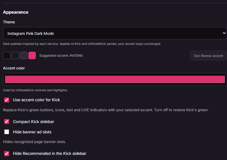
Choose a Theme and inspect its palette preview.
Keep or replace the accent
Selecting a theme preserves your custom Accent color. Use theme accent explicitly adopts the suggested accent.
Inspect the whole workspace
The theme applies to supported native Kick surfaces and UltimateKick panels, while media and native foreground details stay readable.
 Enlarge
Replace Kick's green optionally
Enable Use accent color for Kick if you want supported native buttons, icons, text and live indicators to follow your accent. Turn it off to restore Kick's own green. This is independent of choosing a dark background palette.
Keep navigation compact
Compact Kick sidebar reduces navigation spacing. Hide banner ad slots and Hide Recommended in the Kick sidebar are separate visibility controls in General. They do not change your Favorites list.
Common questions
Why did changing theme keep my accent?
That is deliberate. Use theme accent if you want the palette's suggested color.
Can every green pixel become my accent?
Supported interface elements can follow the accent. Colors inside video, image artwork, badges and emotes remain their original media.
How do I return to the earlier pink theme?
Choose Instagram Pink Dark Mode rather than the newer Instagram Dark palette.
Written for version 1.1. Some controls may be unavailable in an earlier installed release. See release notes.